Case study · Utility consulting

Line Worker Solutions: a utility safety consultancy, finally visible online.
Ken Lulow's team trains and advises electric utilities across the US, but the business had no website, only a logo and brand colours. I built their first website in 12 days, then redesigned it into the bolder site they use today.
- Client
- Line Worker Solutions
- Industry
- High-voltage utility safety
- Location
- Snohomish, WA, USA
- Platform
- WordPress & Squarespace
- Pages
- 15+
- First build
- 12 days
The brief
Years of field work. No website to show for it.
01Before
Only a logo and colours
Line Worker Solutions had years of work with utilities, contractors and crews, and had trained thousands of line workers. Online, there was nothing: no website, just a logo and brand colours.
02The goal
Be recognised nationally
The site had to show what they do, who they partner with, how long they've done it and the training they deliver, so utilities outside their network could find them and ask for a consultation.
03What I built
An authority-first website
A Squarespace site built around services, outcomes and the team: four service pages, a team page, industry partners, a portfolio with project write-ups, speaking and training, and a blog, all leading to one consultation request.
Challenges and results
What stood in the way, and what the site does now.
Results here are what the finished website does. I only publish numbers a client can confirm.
Challenges4
No online presence
Years of utility work and thousands of line workers trained, but nothing a utility could find or check online.
A high-stakes audience
Utility executives and safety leaders need to trust a consultancy's experience before they'll pick up the phone.
A lot to explain
Four areas of practice, expert witness work, speaking and training, industry partners and a portfolio, all for one small team.
Only a logo to start from
No website, no brand guidelines and no page structure. Just a logo and its colours.
Results4
A professional home online
A 15+ page website that shows the services, partners, portfolio and team in one place.
Credibility up front
Who they serve, the services, the outcomes they work towards and the founder's field credentials, all within one scroll of the homepage.
Every service clearly explained
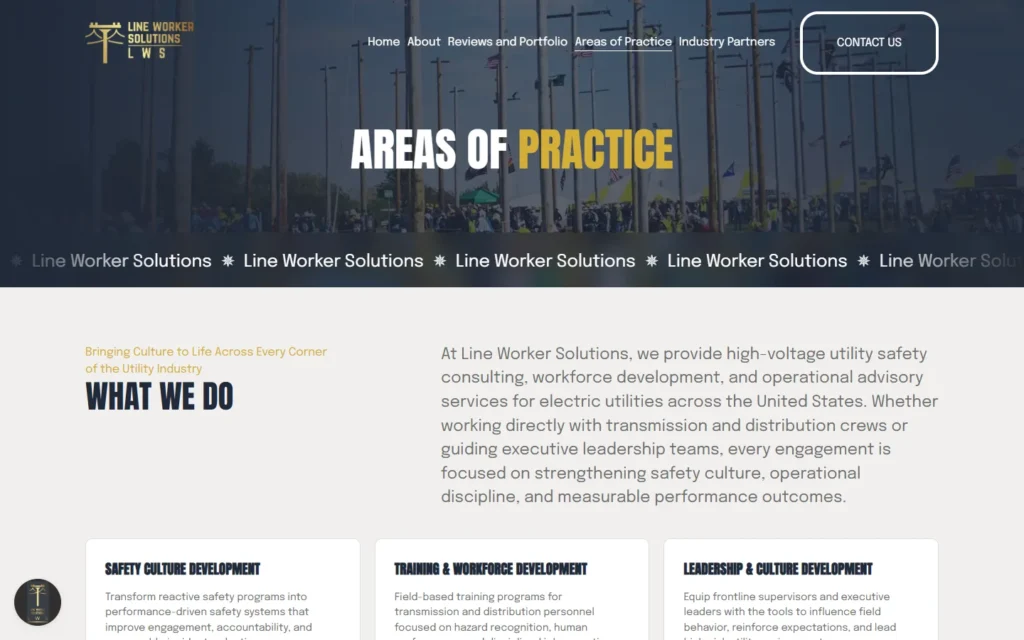
Each area of practice has its own page, written in the language their buyers use, with a clear next step.
A brand that grew with them
The logo's gold became a full visual identity, and Ken came back for a bolder redesign as the business grew.
How I approached it
Research first, then a site built from the brand they had.
Utilities buy on trust and experience. Every decision came back to one question: does this make a safety director more confident to get in touch?
Studied the competition
Before designing anything, I reviewed other utility safety and training consultancies online: what they showed, what they left out, and where their sites were hard to use. The aim was a site clearer and easier to use than theirs.
Built on the existing brand
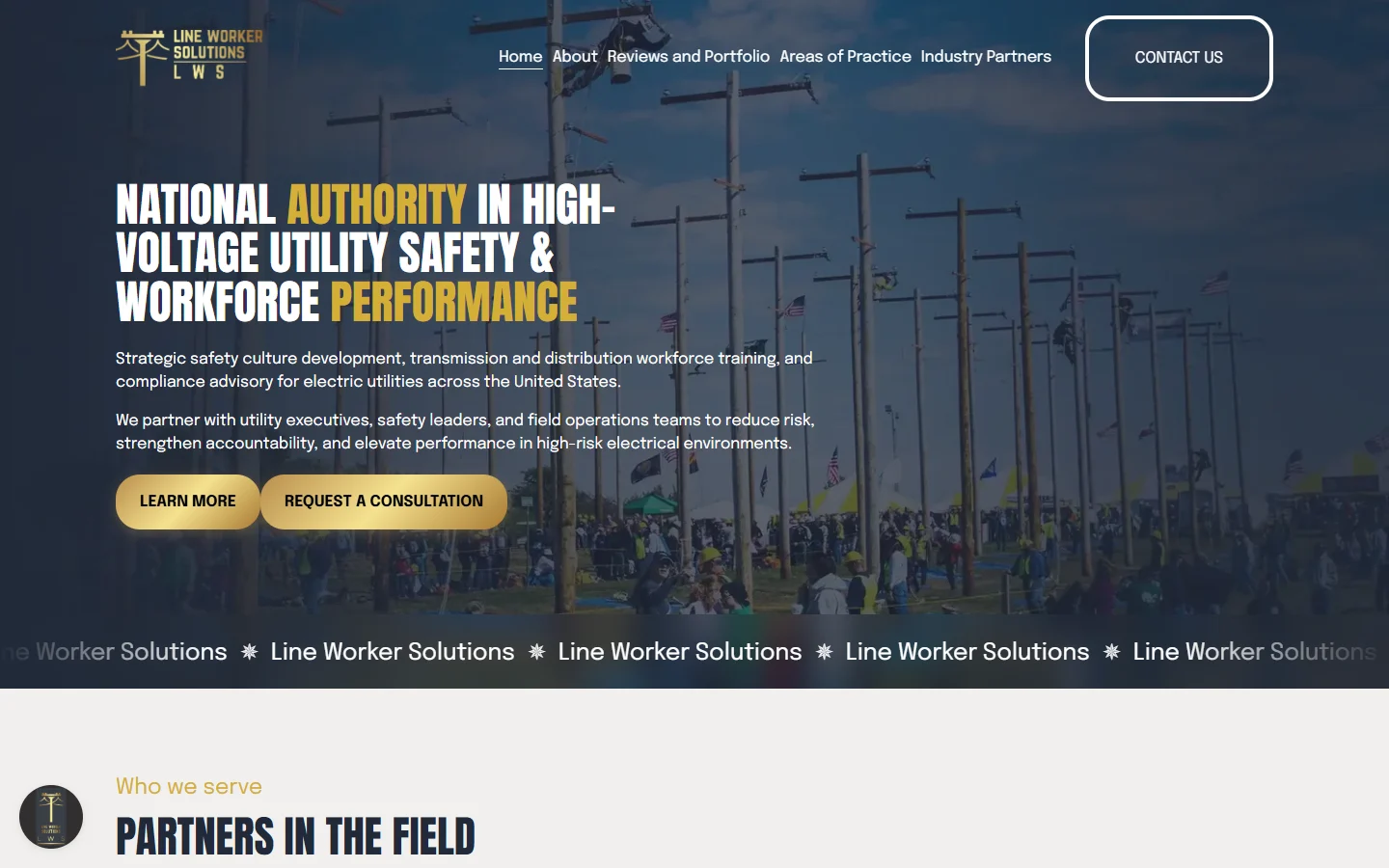
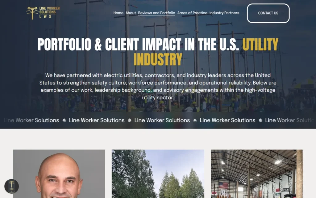
There was only a logo and colours to start with. I followed them exactly and built the full look around them: dark navy and gold, bold condensed headings and real field photography, so the site feels like the industry it serves.
Authority before the ask
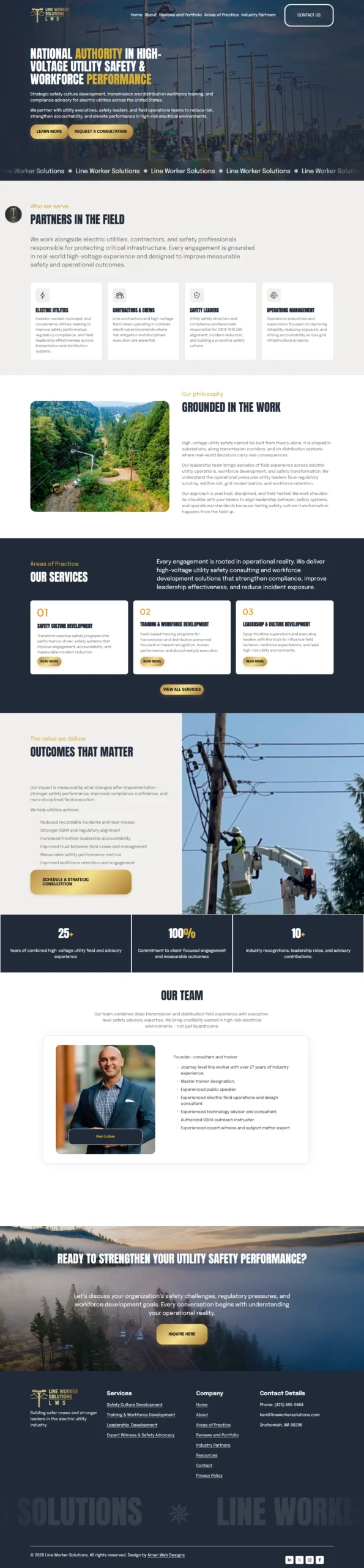
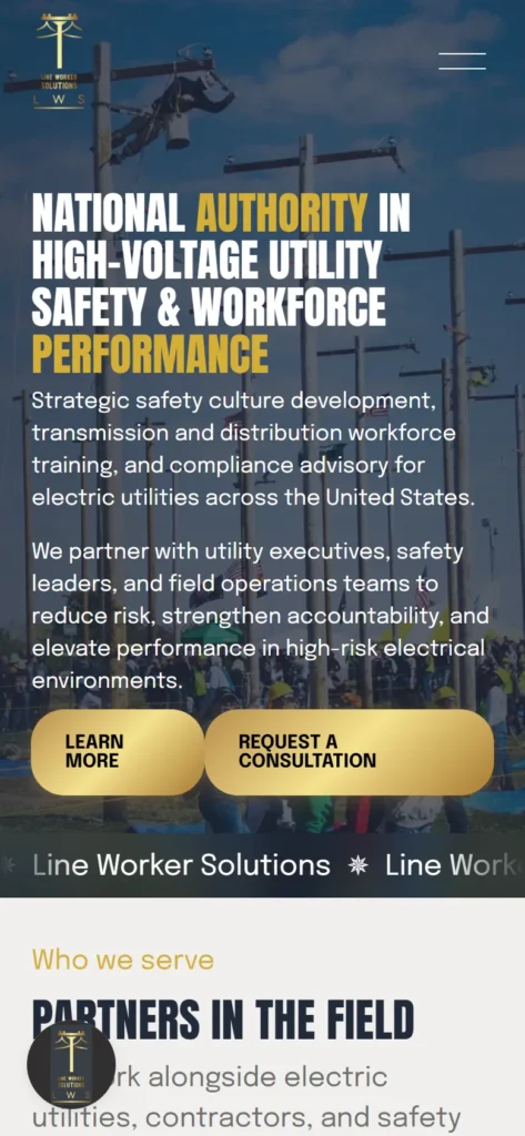
The homepage leads with who they serve, the services, the outcomes they work towards and the founder's field credentials, before asking for anything. Visitors understand who they're dealing with in one scroll.
Copy written with the client
I wrote the copy and refined it with Ken, so each service reads in the language utility executives, safety leaders and field crews use, and every page ends with a clear next step.
Branding
A full brand, built from one logo.
The client had a logo and its colours. These are the fonts and colours the current site uses.
Typography
Headlines
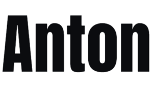
Body text

Anton's tall, condensed capitals feel like the field: strong and direct. Epilogue keeps long service descriptions easy to read.
Colours
Navy
#212A39Gold
#D4AF37Stone
#F1EFEEGold comes straight from the logo and is used for buttons and key words. Navy and a warm stone keep it serious, not flashy.
Logo
The client's existing logo: a utility pole drawn in gold. The whole palette and the gold gradient buttons were built from it.
The website
Inside the site.
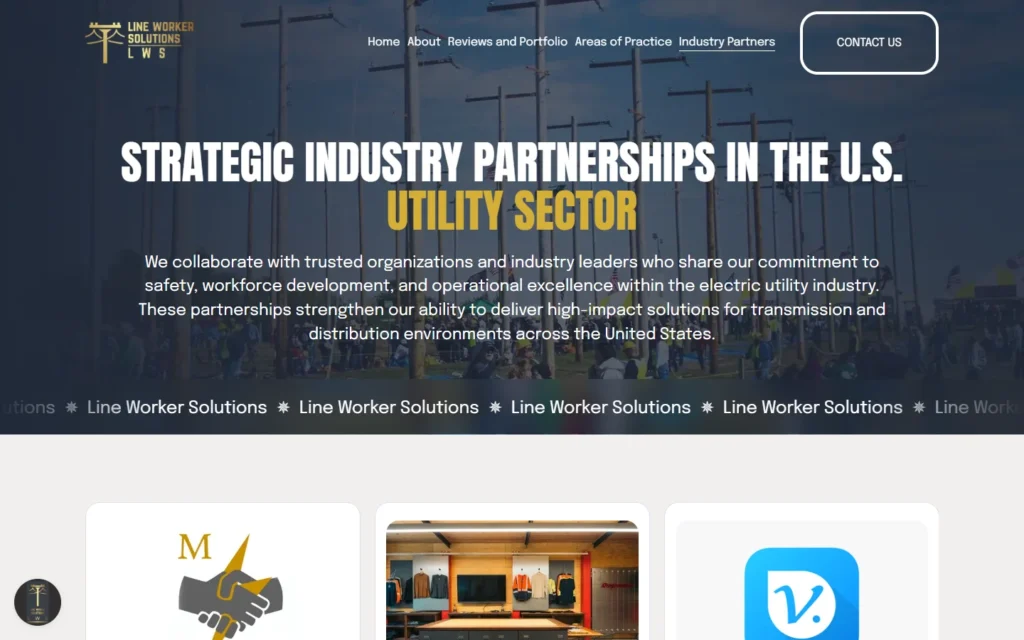
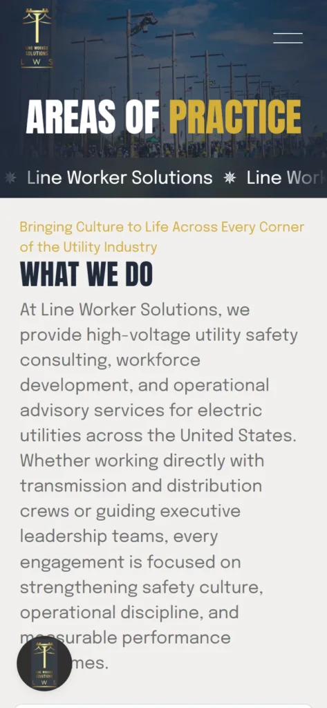
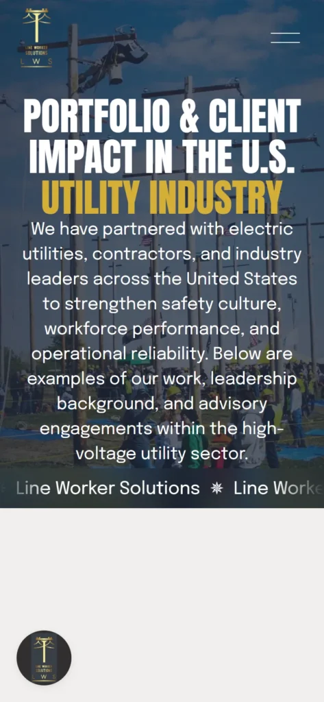
Screenshots of the live website. On a computer, hover over the homepage to scroll through it.
Design versions
One client, two designs.
Ken has stayed with me as the business has grown. Here is the first design next to the site they use today.
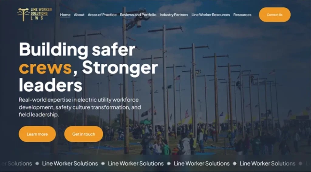
First design
Rounded type, orange buttons and a calm layout. It set up the structure the site still uses: who they serve, services, outcomes and the team.
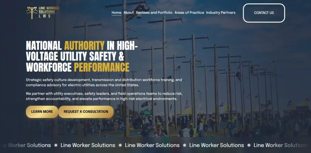
Current design
Condensed navy and gold headlines that match the logo, and a stronger opening line: "National authority in high-voltage utility safety". The same proven structure with a more confident look.
Tools
What the site is built with.

WordPress
Platform for the first version of the website.

Squarespace
Platform for the current site. Ken's team can edit pages and publish articles themselves.

Google Fonts
Anton for headlines and Epilogue for body text, both free to use.
What's on the site
Every page leads to one place: a consultation request.
The main pages of the site, planned so a visitor can go from "who are these people?" to "let's talk" in a few clicks.
- Home
- About
- Our team
- Areas of practice
- Safety culture development
- Training & workforce development
- Leadership & culture development
- Expert witness & safety advocacy
- Industry partners
- Reviews & portfolio + project pages
- Speaking & training
- Contact
- Blog
Result
Aman web design has been amazing to work with. Excellent communication, highly skilled and knowledgeable, creative and most importantly an outstanding understanding of my businesses needs and branding. I am very happy and would recommend for web design.
Ken LulowFounder, Line Worker Solutions
The project started on Fiverr. Ken now works with me directly: I have since redesigned the site and keep helping as the business grows.
Keep exploring