Case study · Online course

Master Your Driving Theory. One Day at a Time.
Seven Day Theory is an online course that helps UK learners prepare for their driving theory test through daily video lessons, focused practice questions and mock tests. Its seven-day structure breaks a big topic into manageable steps.
The goal was a complete course-selling website: a persuasive sales page that explains the program, connected to a simple cart and card checkout, so a visitor can go from discovering the course to buying it in a few clicks.
- Client
- Seven Day Theory
- Industry
- Online Education
- Location
- United Kingdom
- Platform
- WordPress + Elementor
- E-commerce
- WooCommerce
- Scope
- Design, build & checkout

The brief
Turning an Online Course Into a Complete Product Experience.
01Before
A Course That Needed More Than a Website.
Seven Day Theory needed a professional platform to present and sell its driving theory course. Beyond explaining the program, the site had to handle the whole purchase: product setup, pricing, cart, billing details and card payment.
02The goal
One Journey From Discovery to Purchase.
Create a modern, conversion-focused website that shows the value of the course, answers learners' questions and makes buying access quick and simple, with course marketing, e-commerce and payments working together in one place.
03What I built
A Course Sales Website With Integrated Checkout.
Designed and built a WordPress website with Elementor and WooCommerce: a long-form sales page covering the course, the seven-day roadmap, what's included, reviews, the guarantee and FAQs, connected to a cart and a card checkout with billing details, order summary and coupon codes.
Challenges and results
From Course Discovery to Checkout, One Connected Experience.
Selling a course takes more than listing its lessons. Learners need to understand what they are buying, trust the offer and pay without friction. The challenge was to join the marketing and the e-commerce into one smooth journey.
Challenges6
Presenting the Course Clearly.
Learners needed to understand how the seven-day program works, what it includes and how it prepares them for the test, without wading through a wall of text.
Turning Interest Into Purchases.
Unclear pricing, scattered information or extra steps between the sales message and the checkout lose buyers.
Taking Payments on the Website.
The course had to be bought directly on the site, not through manual sign-ups or external payment arrangements.
A Checkout Without Friction.
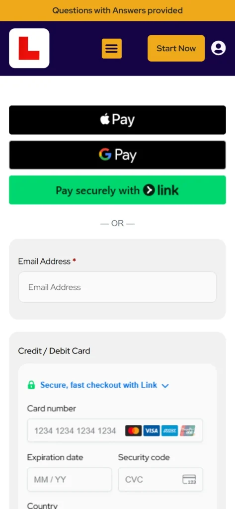
Once someone decides to buy, the checkout must collect billing details, show the order, accept coupon codes and take payment, with nothing in the way.
Building Confidence Before Purchase.
Learners paying for a course want to know exactly what they get and whether it will work for them.
Explaining the Learning Features.
Video lessons, question banks, explanations and mock tests had to be explained simply, without overwhelming visitors.
Results6
A Dedicated Course Sales Page.
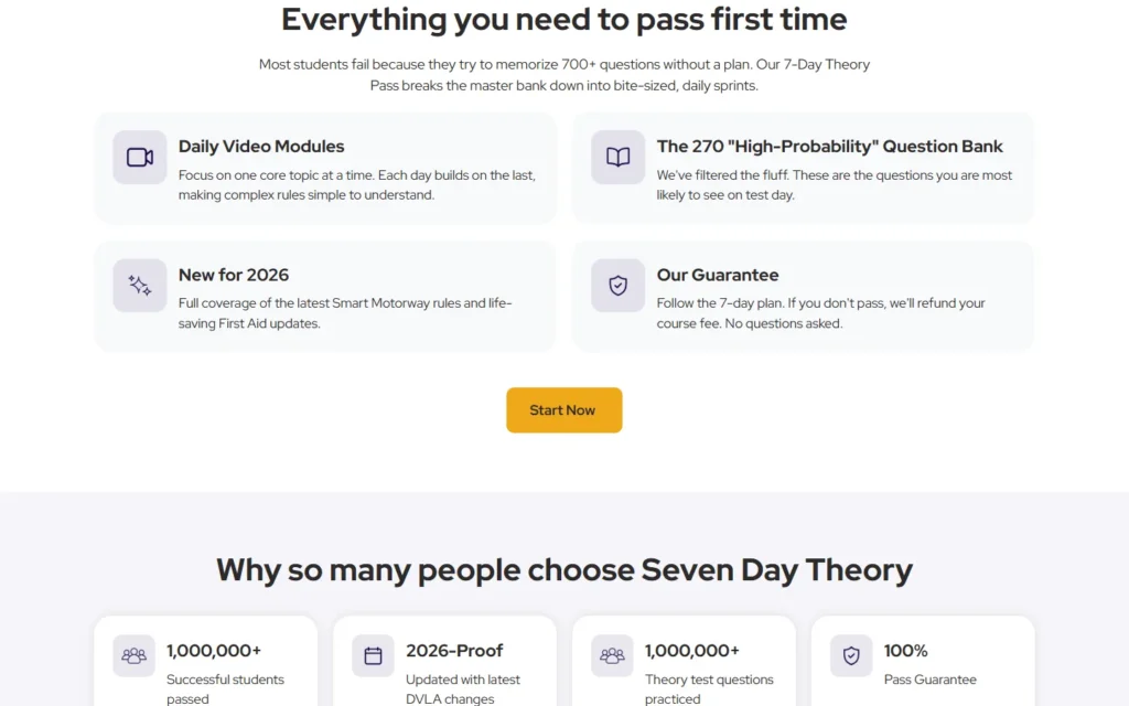
Built a structured sales page covering the learning approach, daily video modules, the question bank, the 2026 content update and the guarantee, with "Start Now" buttons throughout.
A Direct Path From Page to Payment.
Every "Start Now" button adds the course to the cart and opens the checkout in one click, so there is no product page or cart step to get lost in.
WooCommerce Payments Built In.
Set the course up as a WooCommerce product with card payments, so learners buy directly on the site.
A Complete Checkout Flow.
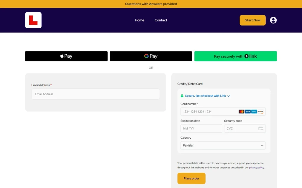
Configured the checkout with billing details, an order summary, coupon codes, payment selection and order confirmation.
Trust Built Into the Sales Journey.
Added student reviews, a "Why choose us" section, the money-back guarantee and FAQs to answer doubts before they become reasons to leave.
Features Explained Simply.
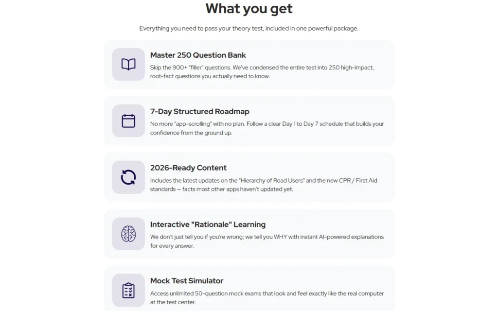
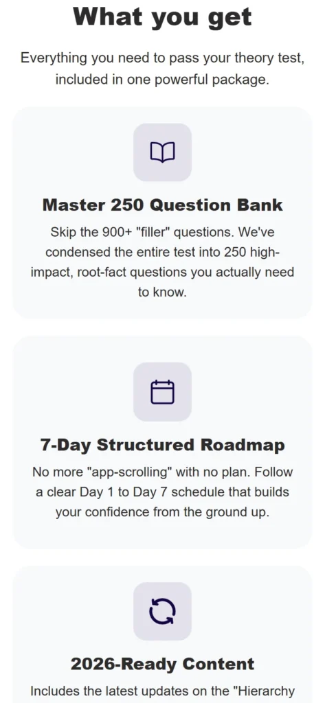
Broke the course into clear feature cards: the question bank, the seven-day roadmap, 2026-ready content, rationale-based learning and the mock test simulator.
How I approached it
Designed to Sell. Built for an Easy Purchase.
Rather than treating the sales page and the checkout as separate projects, the aim was one journey: understand the course, see its value and pay, without a break in between.
Understanding the Product & Audience
Explored the course, its learning structure, the learners it serves and what they need to know before buying.
Sales Page Structure & Design
Planned a conversion-focused page: benefits, features, roadmap, reviews, guarantee, FAQs and well-placed buttons.
E-Commerce & Payments
Set up WooCommerce, configured the course as a product and connected the cart and card checkout.
Checkout & Responsive Refinement
Refined billing, order summary, coupons and payment steps, and tuned every layout for phones.
Branding
A Bold, Modern Identity for Online Learning.
The visual direction is clear and confident: deep purple sections, a bright amber accent for buttons and key numbers, and one strong typeface that keeps the page easy to scan.
Typography
Headlines & body
Red Hat Display
Red Hat Display in extra-bold for punchy headlines and regular weight for easy-to-read body text.
Colours
Deep purple
#150344Royal purple
#361098Amber
#EFA81BMist
#F6F5FAPurple gives the brand a confident, trustworthy base. Amber is kept for calls to action and highlights, so the next step always stands out.
Logo
The client's existing logo.
The website
Inside the site.
Screenshots of the live website, including the real checkout. On a computer, hover over the homepage to scroll through it.


Tools
The Technology Behind the Course Sales.

WordPress
Core platform and content management.
Elementor
Visual page building and custom layouts.
WooCommerce
Course product, cart, checkout and orders.
What's on the site
Every page leads to one place: the checkout.
- Home (course sales page)
- Contact
- Checkout
- Order confirmation
Keep exploring
Building something similar?
 Next case studyKrissy Rey DesignA refined Squarespace website for a South Florida interior design studio, built around livable luxury and clear service paths.ServicesWordPress Website DesignCustom WordPress and Elementor websites for small businesses: fast, secure and easy to update yourself. From $1,200 with a fixed quote, reply within 24 hours.ServicesSmall Business Website DesignSmall business website design from $1,200: a fast, professional site that explains what you do and brings in enquiries. Fixed quote, reply within 24 hours.